Building Cohesion: Scaling the Ultimate Loyalty Reward Platform
Raised component reuse from 64% to 95% across 19 white-label stores, and cut design-to-dev handoff time by ~30%.


CONTEXT
One system for 19 client stores
As a UX Designer at Loylogic, I had the opportunity to build the Ultimate Design System for the Ultimate Reward Store, a loyalty platform serving 10M+ users across 19 white-label client stores.
Each client store had been evolving on its own. Components, spacing, and CSS drifted apart. My job was to build one shared system: design tokens, components, documentation, and an engineering handoff pipeline, so teams could ship faster without rebuilding the same UI every time.
Duration: 18 Months (alongside other Loylogic product work)
Team: 2 Product Managers, 7 Engineers, 1 Sr. UX Design Consultant, and Me
My Role: User Research, Interaction Design, Visual Design, Motion Design, Documentation, Governance
Tools Used: Figma, Miro, Jira, Confluence, Hotjar, Microsoft Suite
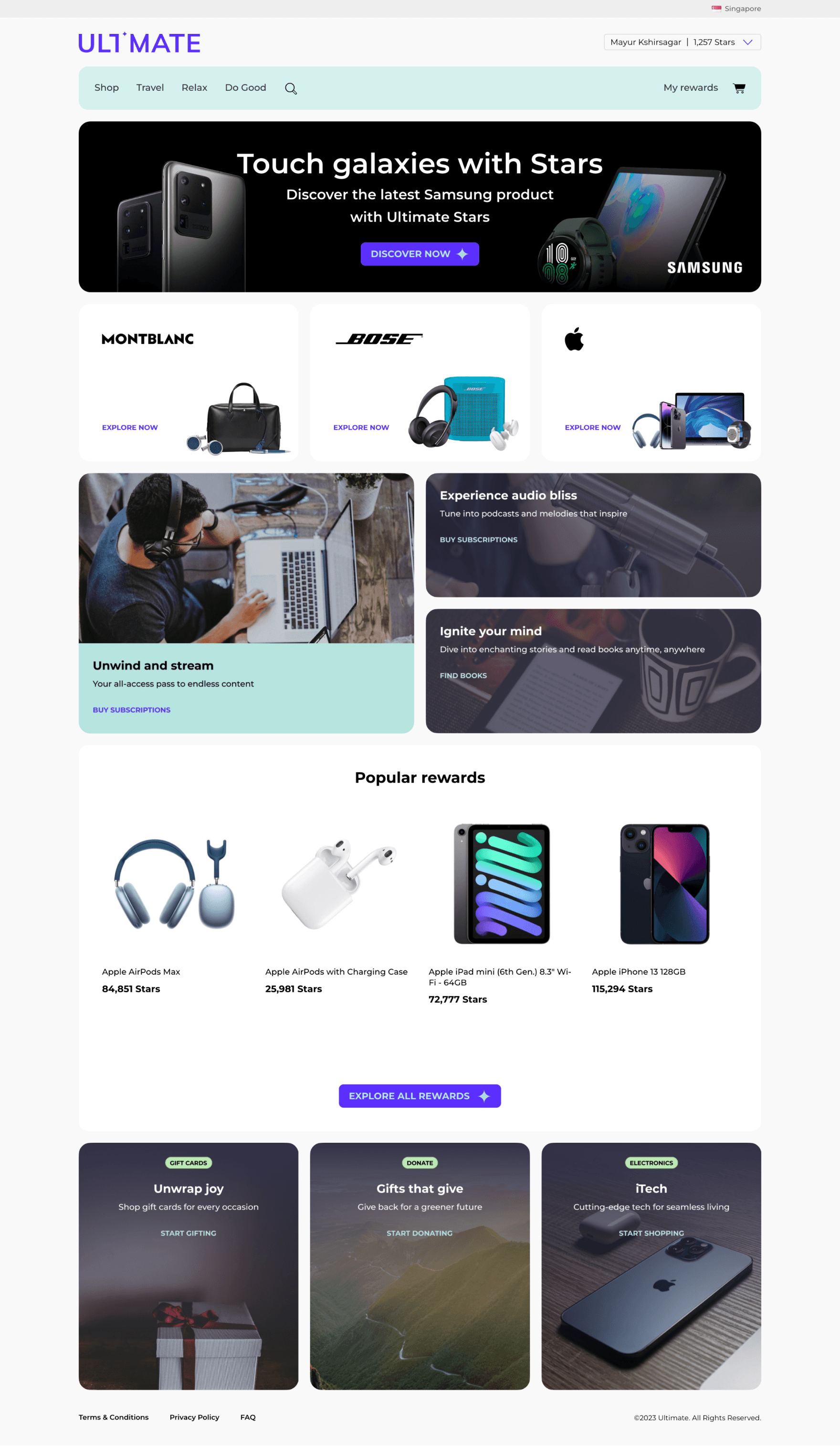
Before
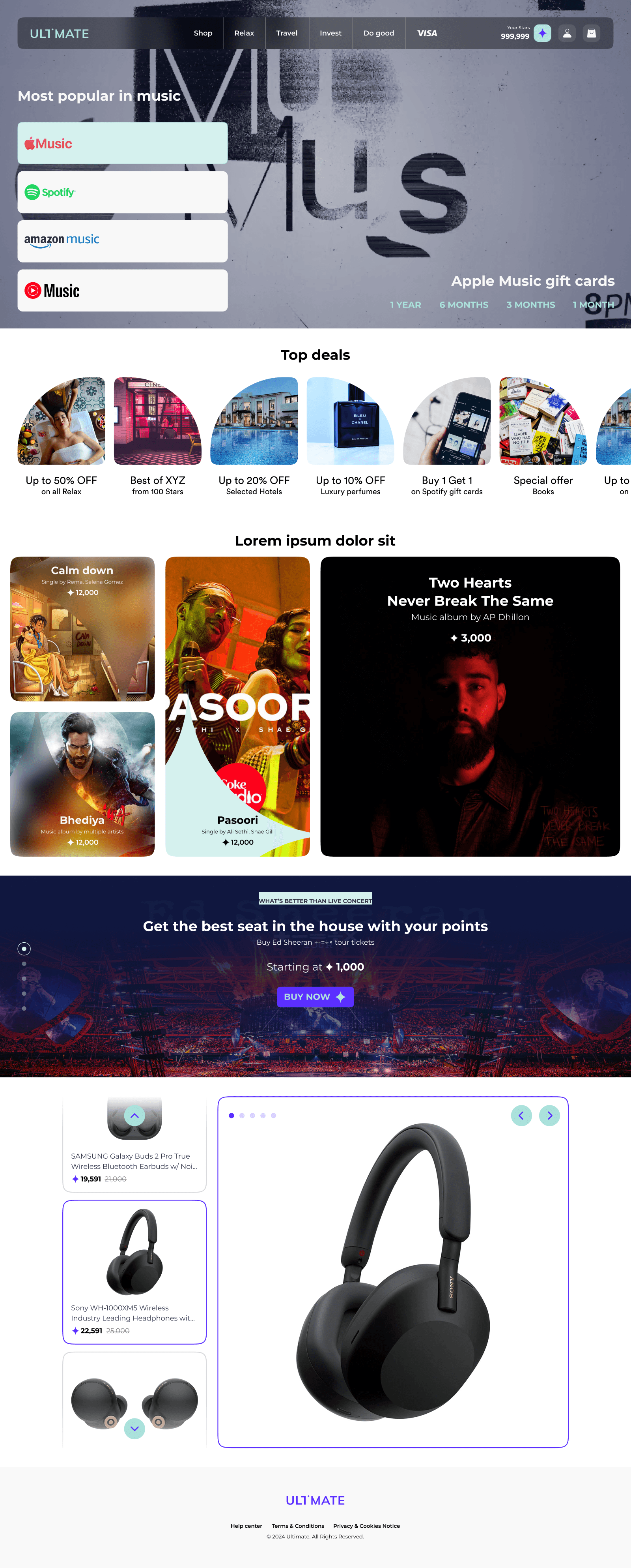
After
THE PROBLEM
19 stores, 19 versions of the same UI
The Ultimate Reward Store was growing fast, but there was no shared design language. Each white-label product picked its own patterns. The same button, card, or filter might look and behave differently from one client store to the next.
That fragmentation created real cost:
Designers and engineers kept rebuilding UI that already existed somewhere else in the org
Handoffs slowed down: more Jira back-and-forth, longer design-to-dev cycles
Custom CSS piled up; duplicate components made global changes expensive
New client launches (white-label stores) took too long to prototype and ship
Without one source of truth, the team spent time fixing inconsistency instead of shipping features.
THE SOLUTION
One design system for every client store
We built a modular design system that became the shared foundation for all 19 white-label stores. It was structured with Atomic Design (atoms, molecules, organisms), and every component used Figma Variants for states like hover, disabled, and active.
What we shipped
Component library: 50+ reusable UI elements such as buttons, inputs, navigation, reward cards, and more
Foundations: Color, type, spacing, and icon rules tied to design tokens, named variables that map design to code
Content guide: Voice, tone, and microcopy rules for buttons, errors, and reward descriptions
Documentation: Usage examples, do's and don'ts, and contribution guidelines in Confluence
Engineering token pipeline: Tokens exported from Figma into code so design changes propagated without manual rework
Governance model: Clear rules for who could add or change components, how variants were named, and how new patterns got reviewed before merge
Why not fix it screen by screen?
We tried patching inconsistency at the feature level first. That worked for one store, but every new client or team added more drift. A centralized system was the only way to:
Reuse the same patterns across all 19 stores
Stop repeating the same design and engineering decisions
Ship new white-label stores faster
Theming at scale
The token architecture supported real multi-brand needs:
Dark mode shipped for Etihad Reward Store
Campaign palettes rolled out for 11 client stores
The design system
THE IMPACT
Quantifying Gains
UI Consistency
40%
Handoff Efficiency
30%
Prototyping Speed
3x
Custom CSS
95%
One product manager, after the system was in place:
“This helps us ship a white label product in 5 business days.”
RESEARCH & INSIGHTS
Understanding the fragmentation
Goal: Map where the 19 stores diverged and what the system needed to support.
Stakeholder interviews: 10 sessions
I interviewed 6 engineers, 2 product managers, and 2 team leads about daily friction: redundant builds, slow handoffs, and theming pain across client stores.
Competitive & industry review
I studied how mature organizations run design systems at scale, including Etihad's Elements design system and the Delta design system, looking at token structure, documentation depth, and how they handled multi-brand theming.
User-facing signals
Alongside stakeholder research, we reviewed Hotjar session recordings, Google Analytics funnels, and QA testing logs to see where inconsistent UI correlated with hesitation, drop-off, or repeated support issues.
Component audit: 19 systems
I audited all 19 white-label stores and measured component reuse at 64%. That baseline became the benchmark for system adoption.
What we learned
Speed mattered most: Engineers lost time rebuilding components that already existed in another store
Theming had to be built in: Dark mode and per-client campaign palettes couldn't be an afterthought; they needed tokens from day one
Consistency built trust: Visual drift made reward flows feel less reliable; users hesitated when patterns changed mid-journey
IDEADTION & PROCESS
Tokens first, then components
Goal: Turn brand and layout rules into variables that design and engineering could both use.
Design tokens were the foundation. Instead of hard-coding hex values or pixel spacing, we named every property such as `color-background-primary`, `color-text-link`, `heading-1`, `functional-body-default`, etc., and linked each token to its code equivalent through the engineering token pipeline.
Foundations we defined
Color: Semantic palette mapped by usage such as background, text, link, not by shade name, so a rebrand updates every store from one place
Typography: A fixed hierarchy for web and mobile
Spacing & layout: 8-point grid for padding, margins, and component sizing
Engineering token pipeline
Tokens were authored in Figma, exported through a shared pipeline, and consumed in production code. That meant a token change in design propagated to all 19 stores without engineers manually hunting for hex values.
Governance model
To keep the system from drifting again, we set contribution rules:
New components went through design + engineering review before merge
Variant naming followed a fixed convention: including a client placeholder in Figma Variants so white-label permutations stayed organized
Documentation and do's/don'ts lived in Confluence so teams could self-serve
Outcome
Global visual changes (a new campaign palette, a type scale tweak) could be executed once at the token level instead of store by store.
DESIGN EXECUTION
Building the library
Goal: Give every team a complete, reusable toolkit built on those tokens.
Atomic structure: Atoms (icons, buttons) → molecules (nav headers, reward cards), all built with Figma Variants for every state and property combination
Token constraints: No off-brand colors or spacing; every component pulled from the shared token set
Platform-agnostic behavior: Components defined by function and structure, not platform-specific code, so web and mobile stayed aligned
Designers could focus on flows instead of redrawing buttons. White-label prototype time dropped sharply because new client stores started from the same component set.
Tradeoffs we made
Flexibility vs. consistency: Limited per-component customization to protect cross-store alignment
Speed vs. scalability: Up-front library work slowed early sprints but paid off across all 19 stores
Design vs. engineering: Simplified a few components where implementation cost outweighed the UX gain
Foundations


Atoms


Molecules


Micro Interactions
Product Guidelines


TESTING & VALIDATION
Proving it worked before full rollout
We treated the design system like a product and tested it with the people who'd use it every day: designers, engineers, PMs, and end users.
Pilot: Etihad Reward Store
The first full build on the new system was the Etihad Reward Store white-label product. We tracked design-to-development handoff time and Jira tickets per feature: both improved measurably compared to prior client launches. The engineering lead and PM validated the numbers before rollout.
Designer adoption check: 2 designers
Two designers rebuilt existing screens using only the new library. The exercise surfaced confusing variant names; we fixed this by adding a client placeholder to variant naming so white-label permutations stayed scannable in Figma.
End-user validation
We ran A/B tests with 5 participants, monitored by PMs and the QA team, on key reward flows built with standardized components. The goal was to confirm that visual consistency reduced hesitation, not just that the system was easier for internal teams.
What didn't work on the first pass
Some early components were over-engineered and needed simplification
Documentation lagged behind the library briefly, which slowed adoption
A few patterns needed refinement after real client-store usage
FINAL OUTCOME & IMPACT
Results across 19 stores
By the end of the project, all 19 white-label systems had adopted the Ultimate Design System. Metrics below were tracked and validated by the engineering lead and product manager.
UI Consistency
40%
Handoff Efficiency
30%
Prototyping Speed
3x
Custom CSS
95%
How we measured each metric
UI consistency (+40%): Component audit across 19 stores: reuse rose from 64% to 95%
Handoff efficiency (~30%): Design-to-dev time and Jira tickets per feature dropped by roughly 30%
Prototyping speed (3×): Time to build a white-label product prototype before vs. after the system
Custom CSS (95% reduction): Near-elimination of one-off styles; duplicate components removed across stores
The system moved the org from reactive patchwork to a shared foundation, one that could support 10M+ users and keep shipping new client stores in days, not weeks.
REFLECTION & LEARNINGS
What I'd carry to the next system
This was as much an organizational change project as a visual one.
Engineering partnership early: The token pipeline only worked because engineering leads helped define what was feasible in code from the start. Design tokens aren't a design deliverable; they're a shared contract.
Governance prevents drift: Contribution rules, variant naming conventions, and documented do's/don'ts kept 19 stores aligned without one person approving every change.
Solve one store, then scale: Etihad was the pilot that proved the system before we asked every team to migrate.
A system stays alive after launch: Components, tokens, and docs need ongoing owners and feedback loops from the teams using them daily.


